Welcome to art school 101 for occultists! This series covers the art basics needed to better read a picture, uncover more layers in your tarot decks, and understand how your own intuition collaborates with the voice of an illustrator.
If you’ve had formal training in art history or practice, you probably know this stuff already. Since most tarot readers have not, I’ve made it as easy as possible. You don’t need any prior artistic knowledge or skill to get something out of these articles, and the observational skills you learn will transfer to any parallel studies in art, design, or history.
If you’ve had formal training in art history or practice, you probably know this stuff already. Since most tarot readers have not, I’ve made it as easy as possible. You don’t need any prior artistic knowledge or skill to get something out of these articles, and the observational skills you learn will transfer to any parallel studies in art, design, or history.
Composition
In fine art and illustration, composition covers how elements are placed within the frame, and arranged in relation to one another. Composition equals where the stuff is.
Compositions and their underlying geometries are the bones of art, making composition one of most important fundamentals to master as a designer, and understand as a viewer. If you did the exercises in the First Look post, you’ve already got a jump on composition—it’s central and unmissable once we bring awareness to the looking.
Ever notice how equally eye-catching and entertaining different styles of art can be, even when they involve different levels of apparent expertise? What is it about a stick-figure cartoonist that makes you want to lend them even more time and attention as a Renaissance master?
Most of the magic falls to content: good writing, humor, emotion, and relatability. On a purely visual level, though, something sets that stick-figure cartoonist’s works apart from your lay-person’s doodles. What makes seemingly low-skilled art so good when you know it’s good but don’t know why? Nine times out of ten the secret skills are internal consistency, and great composition.
You can break all the art rules, dropping color, texture, proportion, symmetry, perspective, and lighting, and still turn heads and take names when you A) break the rules the same way every time, B) maintain a strong voice, and C) master composition.
It’s one thing to understand that composition is where the stuff is. Mastering composition as a maker or decoding it as a viewer is a whole nother bag of jellybeans. Deciding where to put the stuff is a process. An awful lot goes into composition. Let’s get some key terms on your radar:
Exterior Framing & Surface
The first compositional choices artists make revolve around working surface and framing. Surface and framing determine where we’ll be able to put the stuff.
These include:
Scale: How large or small will the finished picture be?
Outer shape: Is the picture square, rectangular, circular, oval, or something else?
Surface/Dimension: Is the finished picture flat? Will it be rendered or projected on a 3-dimensional object? Is that object hard or soft, rigid or flexible, faceted or curved?
Aspect Ratio: What is the proportional relationship between the picture’s sides?
Orientation: Which side or point faces up? If the picture is rectangular, is it a landscape or portrait format?
Presentation: Where will the finished image appear or be displayed? How will it be handled and viewed?
Frame: Will the picture have an external matte and/or frame? What kind? Are we talking a minimal, black, metal frame for an office desk, or an antique, gold, filigreed, wood frame for a museum wall?
Every picture has its bounds. Most tarot decks stick to a few standard forms, scales, and aspect ratios. The standard tarot format is a flat, 2-D, 2.75 X 4.75”, vertically oriented, rectangular card with rounded edges. Some decks use mini, poker-sized, or jumbo cards.
Designers plan for cards to be held in the hands, shuffled, and turned over and upside-down. Almost all decks come with backing designs, usually either symmetrical or busy enough to mask the card’s orientation at a glance. Some decks are round, and this changes interpretations. What do we make of reversals in wheel-shaped cards that can turn a full 360 degrees as they’re shuffled?
Some tarot-themed art is designed for prints or products like tee-shirts. Changes in format alter compositional decisions, while the artwork’s end context alters how we read its symbolism. For instance, a tarot tee might telegraph something interesting about the person who wears it, but it probably won’t tell fortunes for the people who see it walking down the street.
Interior Framing

The Artist's Studio. Johann Georg Platzer. Circa 1740s-1750s.
Once the surface is set, how should the picture fall within its edges?
Will it have an internal border, or will the image bleed out past the edge? In printing, a bleed is an excess area, where the artwork extends beyond the finished frame. Printers can’t lay ink all the way up to a paper’s edge, so finished prints have to be trimmed. A bleed ensures there won’t be any awkward blank lines on the edges after cutting.
Do all the images in the card fit neatly within the edges or borders, or do some images get cut off? Do background elements push out past the edges, while key elements stay within? Are any characters’ bodies cut off? Does the picture zoom in on a detail or face? Does the picture suggest that something is happening out of bounds, past what we can see?
Positive and Negative Space

Blow, Blow Thou Winter Wind. John Everett Millais. 1892.
Positive Space is where the stuff is. Negative Space is where the stuff is not. If your goal is to draw well, it gets more complicated than that. If your goal is to see well, think of positive and negative space like beats and rests in musical rhythms, or inhalations and exhalations in a breath cycle. Every composition contains cracks, gaps, openings, and spaces of visual rest.
Deciding where yes to put stuff means deciding equally where not to put stuff. Most artists know this—formally trained art students get negative space beaten into them, and self-taught folks absorb it intuitively through practice. It follows that most tarot illustrators leave quiet spots as thoughtfully as we fill in the busy bits.
Deciding where yes to put stuff means deciding equally where not to put stuff. Most artists know this—formally trained art students get negative space beaten into them, and self-taught folks absorb it intuitively through practice. It follows that most tarot illustrators leave quiet spots as thoughtfully as we fill in the busy bits.
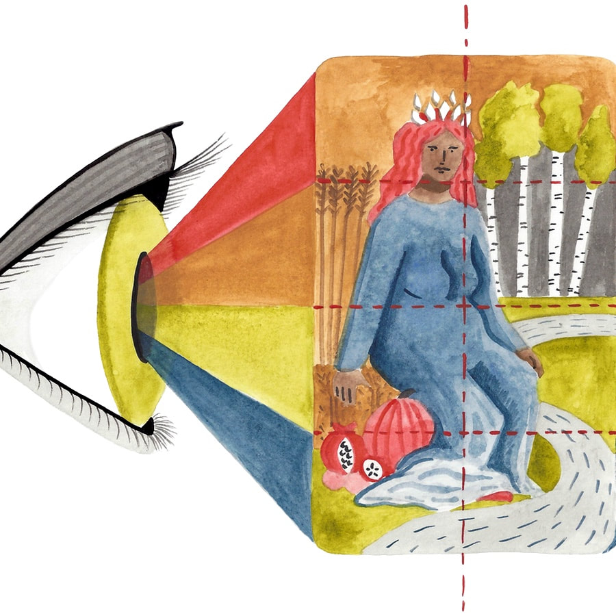
Axes: Center Lines & The Rule of Thirds
Axes are invisible lines that divide a composition along key geometric points.
The primary axes of any composition are the vertical and horizontal center lines, which run evenly through the surface’s midpoints. In technical drawing, center lines are marked with a special dashed line, which alternates between long and short dashes.
Other notable axes fall along divisions of the surface into thirds, as well as along diagonals between corners, and running from corners to center points.
Artists often place key compositional elements along strong geometric axes. Some do this instinctively, and some lay fine geometric guidelines down before sketching, which get covered or erased later.
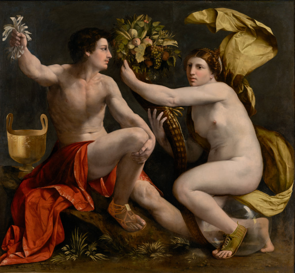
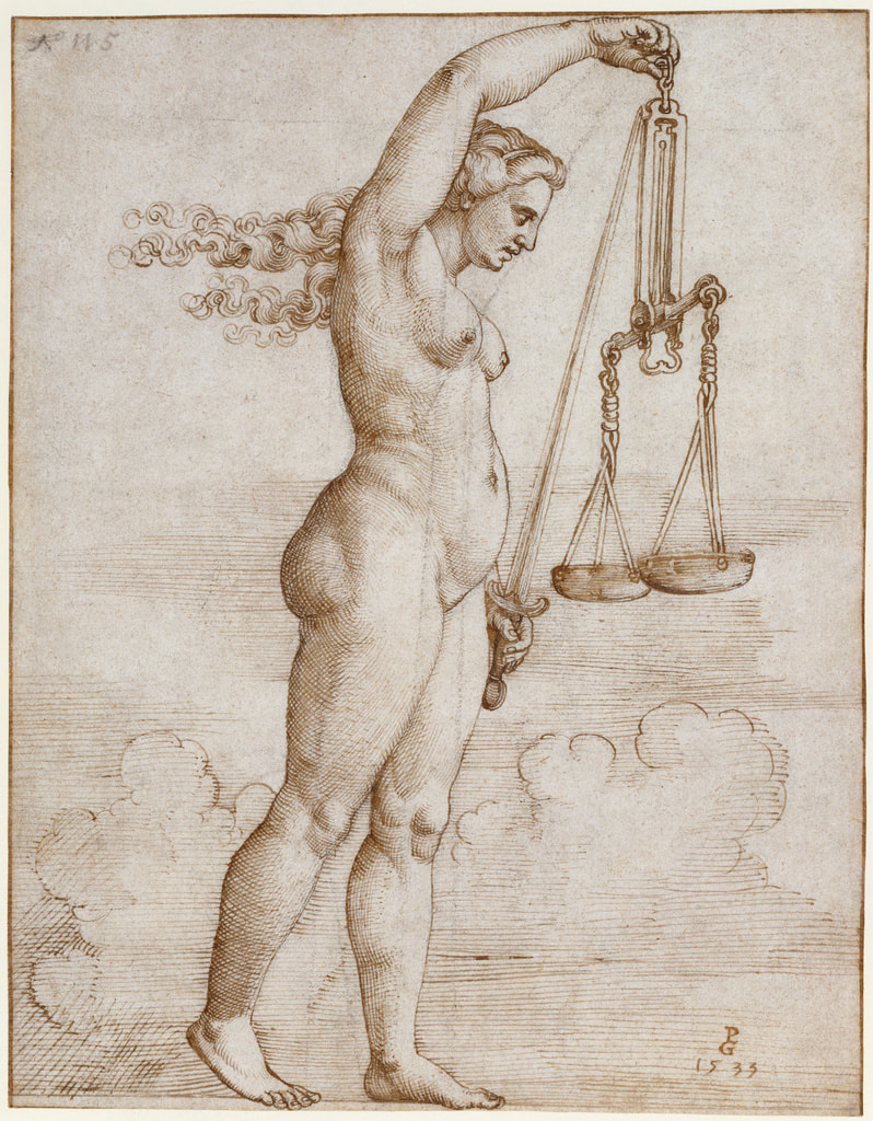 Allegory of Justice. Georg Pencz. 1533. The J. Paul Getty Museum. Note the centered composition and strong left to right, upward slanting diagonal. In tarot art, the format is so small and narrow that it’s perfectly acceptable, and very common, to align key symbols on the center axes. Many compositions with a narrow, vertically oriented frame and a single figure stick closely to the center axes. |  An Offering To Venus. John William Godward. 1912. |
It’s generally frowned upon for designers to over-use the center lines, and perfectly center too many compositions. The Rule of Thirds in art and photography encourages us to image an invisible tic-tac-toe grid on the page, and to align major focal points along the lines of thirds. This is an easy cheat to create a balanced, harmonious composition that keeps the eye moving.

Queen Eleanor and Fair Rosamund. Evelyn de Morgan. Circa 1919. This composition has strong placements along the lines of thirds.
Geometry

La Charette. Louis Le Nain. 1641.
A composition’s underlying geometry can grow quite intricate from there, with key focal points and images falling into all manner of shapes and patterns.
Diagonal lines and triangles create a sense of dynamism and energy. Arcs and arches draw connections, and often generate harmony and balance. Rectangles and squares suggest stability and rigidity. Circles and ovals suggest unity and wholeness.
Artists layer multiple underlying shapes to generate interest and anchor story. A favorite trick in complex compositions and arrangements is to set focal points in a variety of triangular configurations across the page. This keeps the eye moving all around and suggests action.
Proportion

Wall Fragment from the Tomb of Amenemhet and His Wife Hemet. 1976 -1794 B.C.
Proportion describes the relational size of objects in a picture. Proportion applies both internally within elements of a single object, and comparatively between objects.
We say an object is in proportion when the relative size of each of its parts looks true to life, and out of proportion when these relative sizes don’t match life observation. Screwy proportions are a hallmark of amateur drawings, but skilled artists intentionally play with proportion and distortion (purposely skewing an object’s resemblance to life) to manipulate mood and story.
Ancient Egyptian art famously manipulates proportion to code social and divine hierarchy. Western religious art and iconography does this too, including in tarot and occult art.
Distance (Foreground, Mid-ground, Background)

Fantastic Landscape. Paul Brill. 1598.
Distance in composition describes how near or far an object seems to be from the viewer. The foreground includes the material closest to the picture’s surface and the viewer. The background includes the material farthest away. The midground includes everything between foreground and background.
It’s helpful for artists and art-appreciators to think about planes in composition. In geometry, a plane is any flat, 2-D surface that stretches infinitely far in each direction, like a gimungous page that goes on forever. 3-D space can be divided by an infinite number of planes, and so can the imaginary scene in any picture that creates the illusion of 3-D space within its 2-D form. Foreground, midground, and background are each collections of planes.
Some pictures place objects along many receding planes, and create a long sense of distance between the foreground and background.These images have depth. Other pictures drop the 3-D facade and place everything on a single plane, the picture’s surface.
In symbolic art, receding space and depth may suggest mystery and exploration. A flat image on a single plane feels bold and direct, and may mark equal importance between each symbol on the page, especially if those symbols are close in size.
Perspective
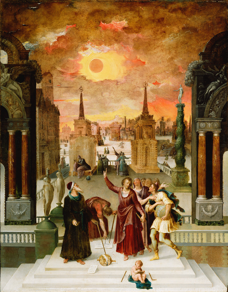
Dionysius the Areopagite Converting the Pagan Philosophers. Antoine Caron. 1570s. The J. Paul Getty Museum.
In art, perspective is a core drawing technique, a set of mathematical rules and tricks that allow the artist to create a convincing illusion of 3-dimensional space and depth. It’s the method that lets us make architecture and interior spaces look “real.”
We call this method perspective because the exact rules and angles are determined by the imagined viewpoint of the onlooker in the scene. Where is the horizon line in relation to the viewer? Are we seeing the scene from overhead looking down, from the ground looking up, or from eye-height, as though standing level with the ground? Are we looking from an angle, or head on?
Perspective lines determine a lot of compositional choices, particularly relating to proportion and distance. The further away an object is, the smaller it appears to the viewer, whereas the largest objects appear closest.
_-_Google_Art_Project.jpg)
Crescent of Houses (The small City V). Egon Schiele. 1915. This Expressionist painting abandons the formal mathematical rules of perspective, while still orienting the viewer above the buildings, looking out and down.
Balance & Symmetry

Ortenberger Altar. Meister des Ortenberger Altars. Circa 1430.
Balance in composition refers to a sense of fairly equal distribution of imagery across those key axes and throughout the page. Balanced compositions generally feel harmonious, whereas unbalanced compositions create tension. A severely unbalanced image might feel humorous, absurd, or unsettling to look at.
Symmetry refers to mirroring across an axis. A Rorschach ink blot is almost completely symmetrical. Kaleidoscope images are symmetrical. Most faces are mostly symmetrical. Symmetry is balancing and pleasing in good measure. It can be meditative, redundant, or downright eerie taken to extremes.
Asymmetry, a lack or disruption of symmetry, can look interesting, funky, edgy, rebellious, or grotesque (especially in a context where symmetry is expected).
Movement
Allegory of Fortune. Dosso Dossi (Giovanni di Niccolò de Lutero). Circa 1530. The J. Paul Getty Museum.
One of composition’s chief aims is to generate movement. Movement happens in visual art when the viewer’s eye drifts all around the page, from one spot to the next and back. Generally speaking, the more the eye wanders, the longer the viewer keeps looking, the more they find, and the more engagement they feel.
Movement is easy to provoke when we place objects along an intricate, interlinked series of underpinning shapes. We can also set objects so that one points to another, creating little trails to follow across the picture.
The smaller the working surface, the more challenging it is to create movement, but it can be done. How do your favorite tarot cards guide your eye throughout the image?
Predictability & Unpredictability
Underpinning geometries govern a composition’s predictability. The eye intuitively expects key elements to appear along key axes. If most focal points form a clear shape, the eye unconsciously expects other focal points to fall in line.
Breaking these expectations creates a sense of unpredictability and intrigue. Disrupting balance and symmetry, and playing with moving objects in and out of geometric alignments allows the artist to manipulate focus.
For instance, placing a large, bright object off-axis draws attention to it, and may prompt unease in the viewer. Conversely, placing a small, modest object outside a strong underlying shape hides it from first glance and makes the viewer work to find it. Geometry is thusly good for sneaking.
Decoding Composition
Now that we’ve covered what composition means and what goes into it, we can decode composition in tarot art. Pick a card, and scan it for each of the compositional elements I outlined above. It can help to photocopy a card and trace its geometries, including axes, prominent shapes, and connecting arrows with a marker or hi-lighter.
Pay attention to axes, center-lines, and third lines. Key symbols usually pop up here. When a large focal point falls on a major axis, it often means the artist wants to you think about that symbol or archetype first.
Pay attention to proportion. The biggest images are important, and cover the card’s primary meanings. Tiny details cover allusions, correspondences, and secondary and tertiary meanings.
Pay attention to core shapes. Circles and wheels symbolize cycles, unity, holism, progression, and time. Ovals and eggs may symbolize fertility, birth, and initiation. Squares and rectangles symbolize stability, stasis, foundation, power, and tradition. Vertical lines and columns link between upper, middle, and underworlds, and may represent transmission, contact, or the passage of knowledge.
Arches, gates, doors, and emphasized horizon lines mark boundaries between worlds and nod to the spiritual, subconscious, or imaginal. Edges, boundaries, gates, and transitions are symbolically rich in tarot art. Depending on context, they may mark the bounds between interior v. exterior, private v. public, outside v. in, waking v. dreaming, ego vs. unconscious, living v. dead, upper v. chthonic, human v. divine, and this world v. the otherworld.
Pay attention to movement, and how each object points to or communicates with others. This run-down on composition should give you a better understanding of how your eye traveled across the cards in our first look exercises.
Pay attention to predictability and unexpected choices, particularly regarding balance, symmetry, and proportion. How does the artist manipulate your focus and generate mood by bending the guidelines or going against the grain? Are there any distortions or grotesqueries in the composition? Is there humor? Intrigue? Tension?
Composition in Three Dimensions
There’s a strong resonance between composing a picture and arranging objects in 3-D space for installations, sets, retail displays, home decor, photo setups, and even altars. If you’re an Instagram witch or small business owner, you might understand more about composition than you realize! Artists compose scenes on a page or canvas much as we might arrange items in a room or display.
Next time your arrange your home decor, or re-set an altar space, think about the fundamentals of composition. How can you use these techniques to make your display more pleasing? How can you use them to change the mood, tell story, and infuse more meaning into your space and the special objects you place there?
Extra Credit
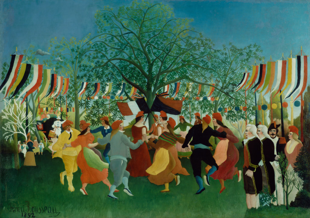
A Centennial of Independence. Henri Rousseau. 1892. The J. Paul Getty Museum.
Folk art is a great place to study composition because most folk-artists are self-taught, and don’t rely too heavily on academic techniques, or subscribe too closely to particular movements.
Many self-taught artists master color and composition through intuition or DIY observation. This leads to creative and surprising decisions. The self-taught path can give creatives an edge on composition that some classically trained artists lack.
The American Folk Art Museum has tons of wonderful images you can browse, from all around the world. I highly recommend spending some time on their website, thinking about everything we've covered on composition. Start with their paintings collection.
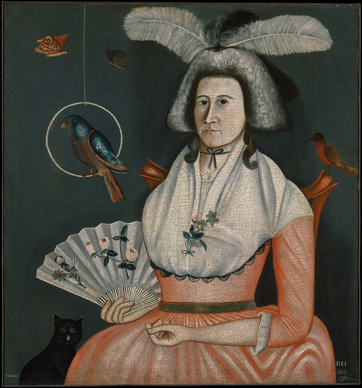 Lady With Her Pets. Rufus Hathaway. 1790. The Met Museum. | 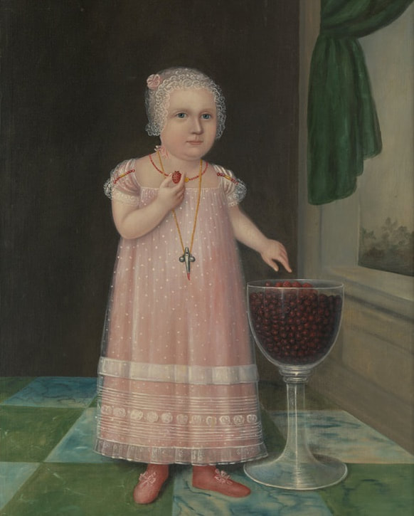 Emma Van Name. Joshua Johnson. 1805. The Met Museum. |
Recommended Reading:
Picture This: How Pictures Work by Molly Bang
Visual Intelligence: Sharpen Your Perception, Change Your Life by Amy E. Herman
Drawing On The Right Side of The Brain by Betty Edwards
Designa by Adam Tetlow, David Sitton. Lisa DeLong, Scott Olson, David Wade, and Phoebe McNaughton, Wooden Books
Visual Intelligence: Sharpen Your Perception, Change Your Life by Amy E. Herman
Drawing On The Right Side of The Brain by Betty Edwards
Designa by Adam Tetlow, David Sitton. Lisa DeLong, Scott Olson, David Wade, and Phoebe McNaughton, Wooden Books
 RSS Feed