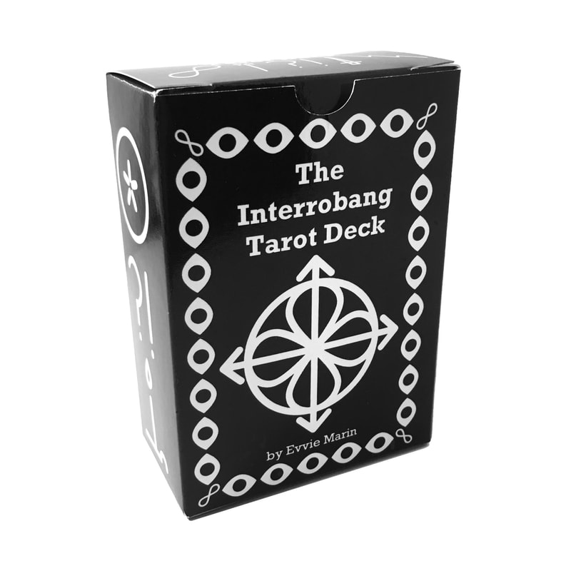
Good news, friends! I have made a tarot deck happen. A complete one, and a new one. Introducing the Interrobang Tarot Deck!
UPDATE 12/01/19: COMING SOON! I delayed the release of this deck to write a more complete guidebook. Both the Interrobang and Black Ink Tarot Decks will be out in the winter of 2020! Stay tuned Jan.-Feb. for more details!
UPDATE 12/01/19: COMING SOON! I delayed the release of this deck to write a more complete guidebook. Both the Interrobang and Black Ink Tarot Decks will be out in the winter of 2020! Stay tuned Jan.-Feb. for more details!
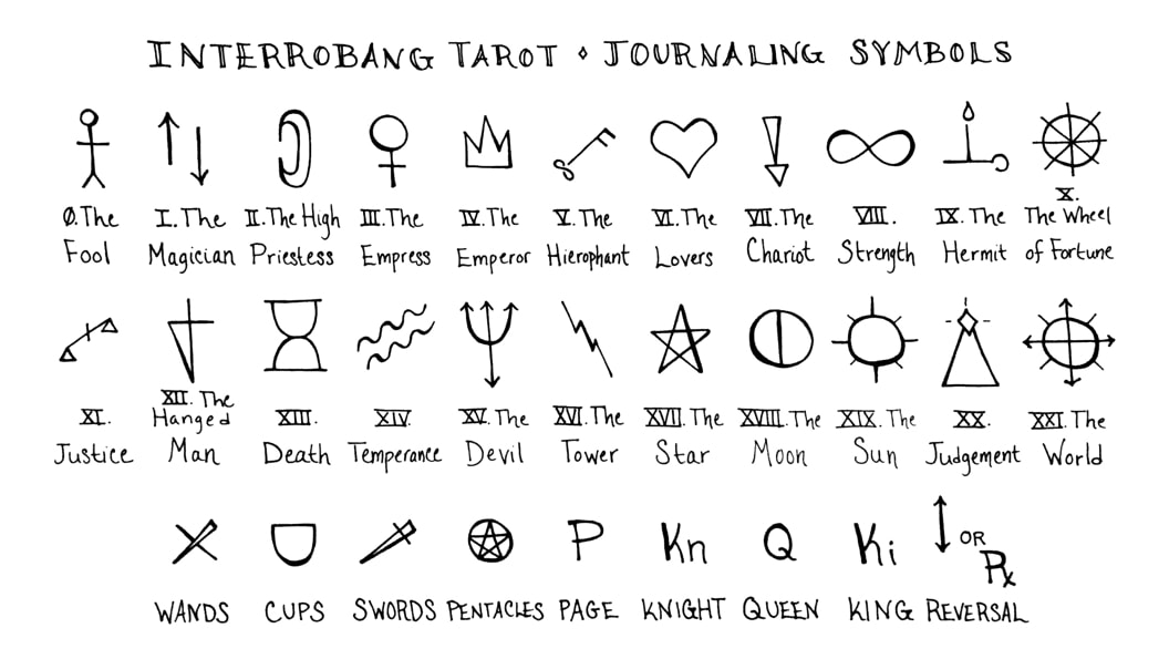
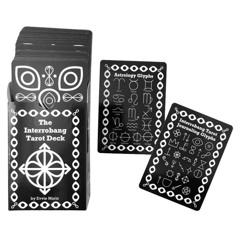
Interrobang Tarot Journaling Glyphs
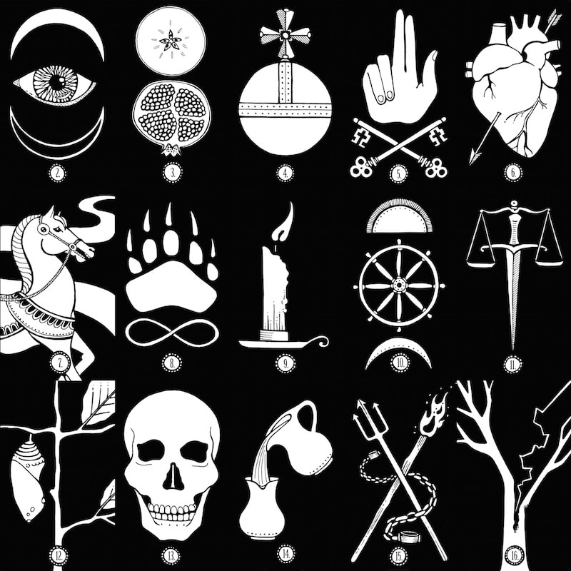
This sweet little deck is based of the Interrobang Tarot Journaling Glyphs you’ve seen me post about and use throughout the graphics here. I created the original set of glyphs back in 2015, to double as line art for the blog and shorthand symbols for tarot journaling.
After working with the glyphs for a few years, I ID’ed some design hiccups and created a revised set that’s more elegant, completely gender neutral, and has little overlap with other occult symbols, so they can be used in tandem with astrological and alchemical glyphs without confusion. (I’ll release an updated chart with details on the blog after the deck comes out.)
I’d had it in the back of my mind to create a minimalist deck with these, ever since I blogged that first round of symbols. When I redid my site graphics last fall, I realized the time had come.
I’d had it in the back of my mind to create a minimalist deck with these, ever since I blogged that first round of symbols. When I redid my site graphics last fall, I realized the time had come.
Design Features
I designed this deck to meet my own needs, for the blog, Instagram, and my backstage writing process, using clean, original vector drawings. I love the end result so much, I think it’s good enough to share! There are so many wonderful, minimalist decks on the market already. Here are the key design features that set this one apart:
Poker-size Playing Cards
This deck is ideal for small or weary hands, or for laying out and photographing large spreads in small spaces. The cards are smooth with a semi-gloss finish, UV-coated to protect against light and grime, and easy to shuffle. The deck feels good, and is super easy to work with physically, without straining those paws!
Decorative & Organizational Borders
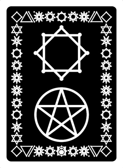
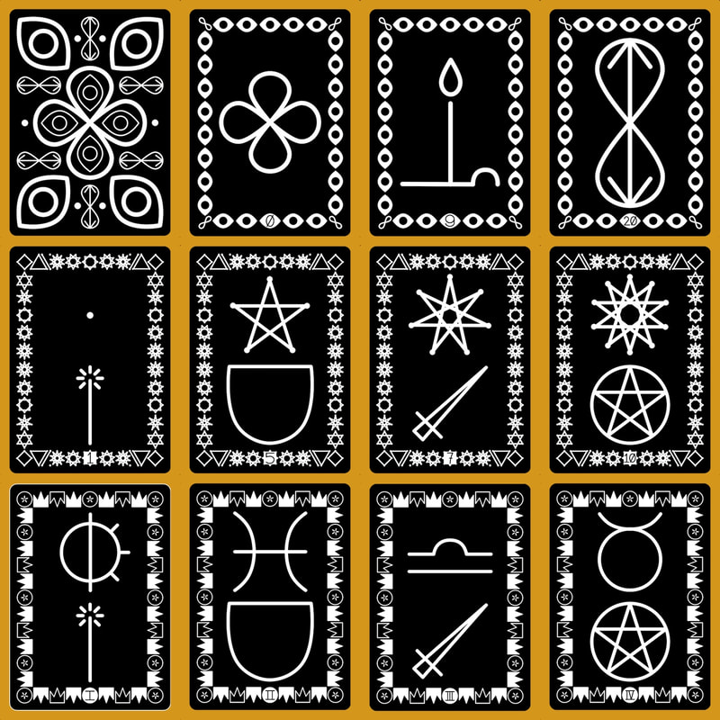
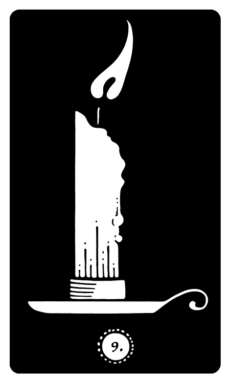
Three distinct borders set the majors, minor pips, and courts apart at a glance, which makes interpreting minimalist artwork much easier in the practice of a tarot reading.
This project treats the court cards as their own separate category, denoting people, character, and seasonal timing, while the pips show day-to-day patterns, moods, and events.
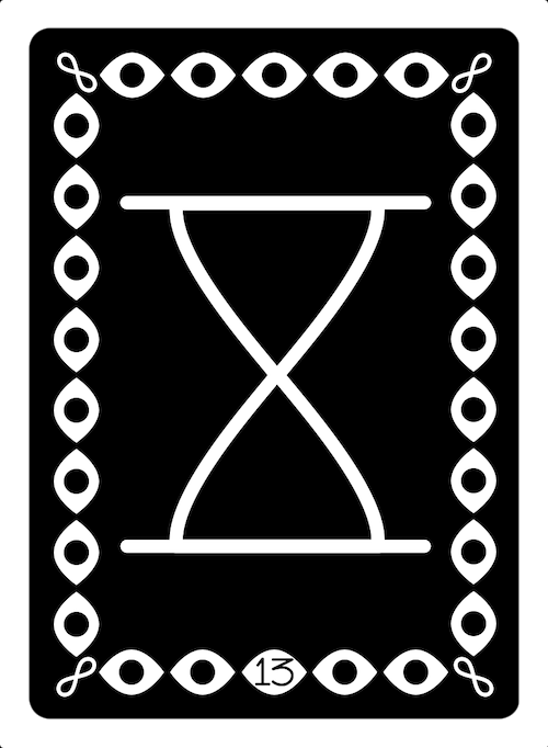
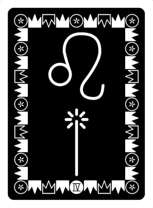
Card numbers at the bottom of each border identify each card, and make it easy to read reversals even with the symmetrical glyphs. Strength and Justice are both numbered “8/11.” That’s good news if you take notes from multiple tarot systems, like Golden Dawn and Marseilles.
Building-Block Glyphs
All the glyphs in this deck cut right to the building blocks beneath tarot symbolism, so it works well as a stand-alone deck, or a supplemental tool.
For your journaling convenience, the major, suit, and court symbols are each as easy to draw as any letter, number, or punctuation mark.
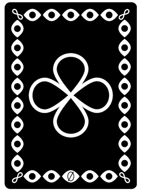
| Each Major Arcana glyph contains multiple layers of meanings that cut deep, but are easy to memorize and spot once you know what’s there. These are explained fully in the extended guidebook, which includes keywords for the glyphs, as well as traditional upright and reversed card meanings. For example, The Fool is formed of two intersecting lemniscates (infinity, flow), crossed like a crossroads. These symbolize the Fool’s open flow state, seeming immunity, and wayward travels. At a glance, the symbol reminds us of the white rose The Fool holds in so many decks (innocence, purity, love), or a four-leaf clover (luck, fortune, gumption, protected naif). |
Geometric Pips
The numbered minor cards show geometric forms with suit symbols to get down to the numerological and elemental underpinnings of each pip story. The geometric forms aim to help establish an intuitive grasp of the numerology in tarot, which derives significantly from geometry.
Astrological Court Cards
The courts are based on astrological and seasonal correspondences. They’re marked with roman numerals rather than titles, so it’s easy to remember their traditional rank when desired, and easy to disregard that rank to work with alternative titles, disrupted hierarchies, or astro correspondences from a different school of interpretation. (I correspond pages to seasons, knights to mutable, queens to cardinal, and kings to fixed signs.)
The Little White Book and Medium White eBook both include keywords for traditional astrological traits, tarot-specific traits, and shadow traits of each court card.
I’ve designed a simple and intuitive set of seasonal glyphs based on astronomy and the compass points, that work in any hemisphere. Have y’all seen the alchemical symbols for the seasons? They are bonkers, and not the easiest to draw. Many other seasonal symbols relate to weather patterns, making them region or site-specific.
I’ve designed a simple and intuitive set of seasonal glyphs based on astronomy and the compass points, that work in any hemisphere. Have y’all seen the alchemical symbols for the seasons? They are bonkers, and not the easiest to draw. Many other seasonal symbols relate to weather patterns, making them region or site-specific.
The sun always rises in the East and sets in the West, everywhere beside the poles. Summer is the season of most sun, and winter the season of least sun, in either hemisphere. So the righthand or east-pointing sun glyph represents increasing sunlight and spring. The upward-pointing sun glyph (sun above the horizon line) represents peak light, longest day, and summer. The lefthand or west-pointing glyph represents waning light and autumn. The downward-pointing sun (sun below the horizon line) represents low light, longest night, and winter.
Gender-Neutral Imagery
This is one of my top priorities as a nonbinary author. All the artwork in this deck is completely gender neutral. The extended guide book includes both traditional and alternative, gender-neutral titles and interpretations. This facilitates inclusive readings for genderqueer folks, and makes it super easy to interpret traditional cards for binary and cis folks across gender lines. It's a gentle system that leaves room to see gender reflected in the cards without falling back on gender essentialism or getting mired in outdated stereotypes.
Guidebooks
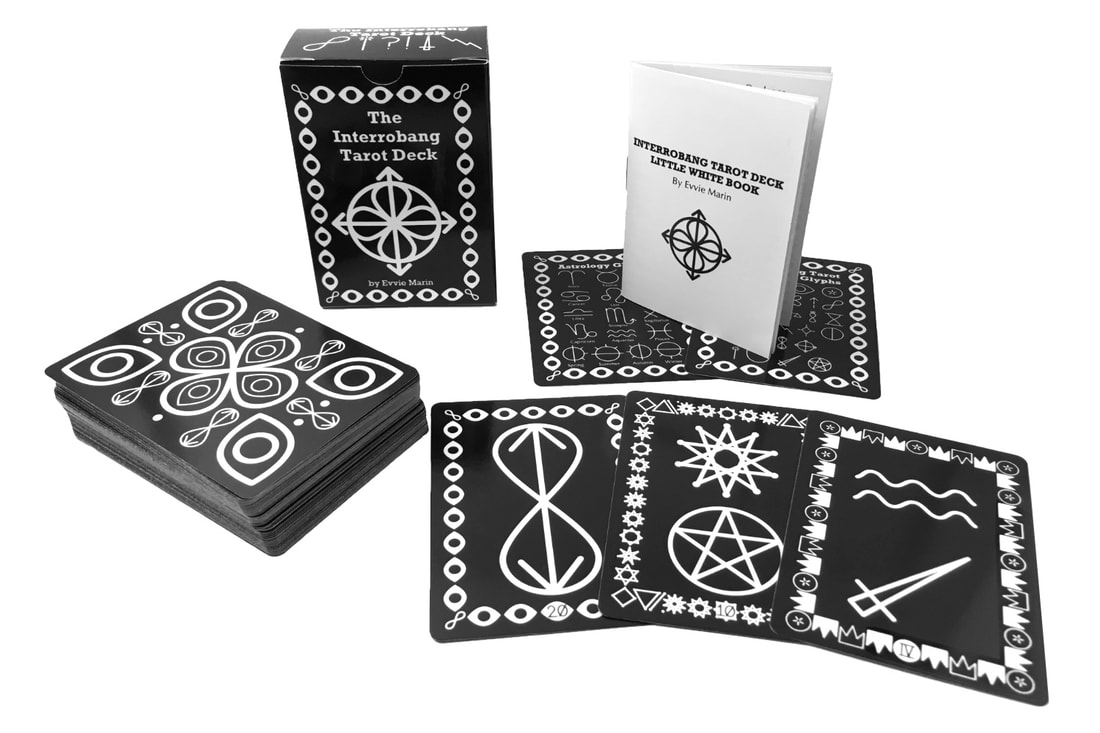
Each deck comes with the Interrobang Tarot Little White Book, and two extra guide cards showing the Major Arcana journaling glyphs and the astrological glyphs at a glance. The LWB is an itty-bitty, concise and legible, 20-page booklet featuring a brief selection of important keywords for each card.
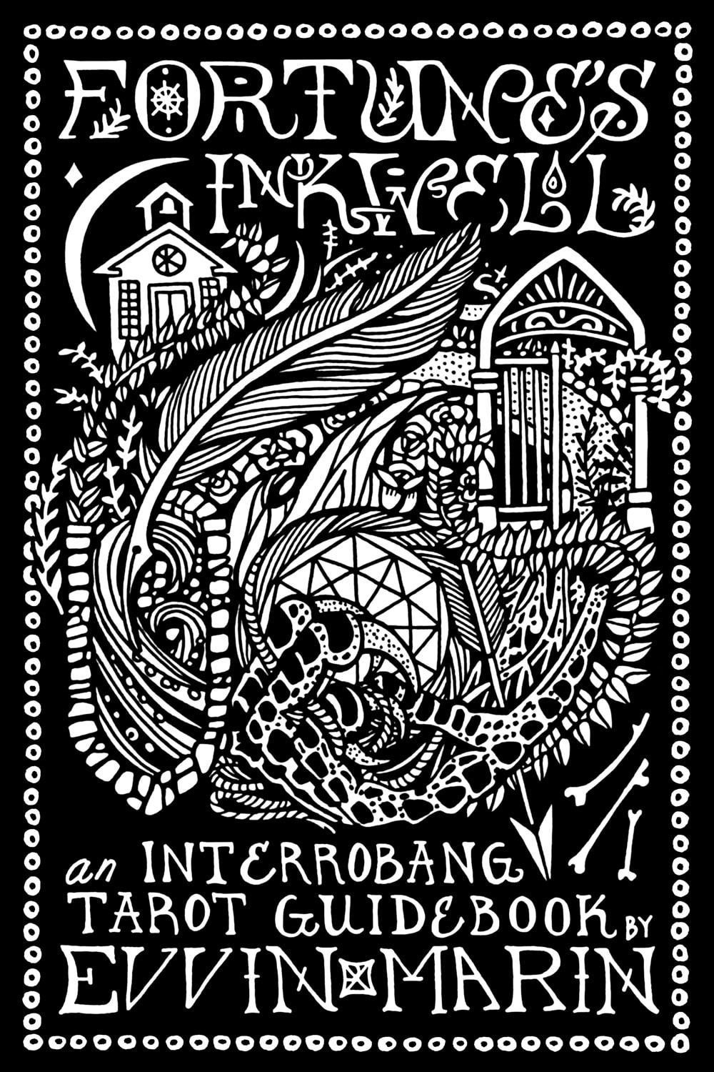
I’m writing an extended Interrobang Tarot Medium White eBook, which covers all the deck symbolism in much greater depth, with a whole lot of extra material. This guidebook doubles as a companion to this deck, and a stand-alone Tarot 101 text, written from that forward-looking, enby, art-centered perspective you hang out here for.
The first 50 decks will include a secret code to download a free copy of the Medium White eBook.
| Style The deck and booklet come in a super cute tuck box, and the whole set has a fun, retro-psy look. If you're nostalgic for Zener cards, but want those funky squiggles to mean something, this is your deck. The mystic, eye-patterned backing design and intricate borders add a pop of decoration, while keeping it simple. It’s a no-frills, bare-bones, workhorse deck that still looks good and feels connected to its classic roots. |
Sticky Wickets
Potential sticking points for some include wait time, card sorting, and card-stock thickness.
I’ve gone with The Gamecrafter as my on-demand manufacturer for the first edition. They’ll let me ship a fine product worldwide, made in the USA, and at a great price. But they don’t have the card-stock selection of larger manufacturers, they don’t pre-sort the cards for you. Hence:
Wait time: These decks are made to order, which means waiting an extra few days to a week for manufacturing before shipping. Mind the estimated shipping ranges on the checkout site.
Card Sorting: The cards will arrive in a random order in the box. They’ll all be there, but you’ll have to arrange them in order yourself. It’s not bad in practice. This is a nice way to look over and start connecting to a new deck, and something I do periodically with old decks anyway.
Card-Stock Thickness: The latest trends in boutique, indie tarot decks have leaned toward ever thicker and heavier card-stocks. If you’re accustomed to working with very heavy cards, this deck might be an adjustment. It feels like a classic playing card deck in terms of weight and has a semi-gloss finish.
To me, this is all a plus. It’s exactly what makes the cards easy to shuffle. I want a deck that I can handle heavily without straining my spoonie paws, and that I don’t mind beating up a little. If that’s you too, I think you’ll love this. If you prefer something weighty, boutiquey, or gilded, it might not be your main squeeze.
Early Praise
“Neat! It’s a tarot reader’s tarot deck.”
-Dad (Who has no idea what all these wacky symbols mean.)
“Wow! If I saw this and didn’t know it was by you, I’d still want this deck.”
- Mum
(They don't get this excited about everything I do, you guys!)
-Dad (Who has no idea what all these wacky symbols mean.)
“Wow! If I saw this and didn’t know it was by you, I’d still want this deck.”
- Mum
(They don't get this excited about everything I do, you guys!)
Release
The artwork is completed, the proof came in looking excellent, and I’m about 1/3 way through the extended guidebook. I’m taking a few weeks to polish that up and start working with and photographing the cards.
The first edition will be available to order on demand from The Gamecrafter for $30 USD, plus shipping. It prints in the US and ships worldwide from Wisconsin. Pricing on the Medium White eBook is still TBD, but the first 50 deck orders will get that secret code to snag a free digital copy, so stay tuned!
Sign up for my updates newsletter to get a notification and shopping link as soon as the decks go up for sale.
| P.S. If you’ve been following for a while, you know that this is not the only tarot deck and book I’ve got in the works. All those other projects are still simmering. I’ll have a follow-up progress report on those sometime this spring. This one snuck up to the finish line before the others, and in secret to your eyes, but I’ve realized that it truly had to come first. While the glyphs took time to refine, the guidebook I’m writing now lays the foundation for the next decks’ texts. These projects have a mind of their own. I’m excited to see where they’re headed! I hope you are too |



 RSS Feed
